codexy design system
opensourceMay 2026 – present
A UI design system in the Codex style. Tokens, components, and documentation, released as open source for anyone to build on.
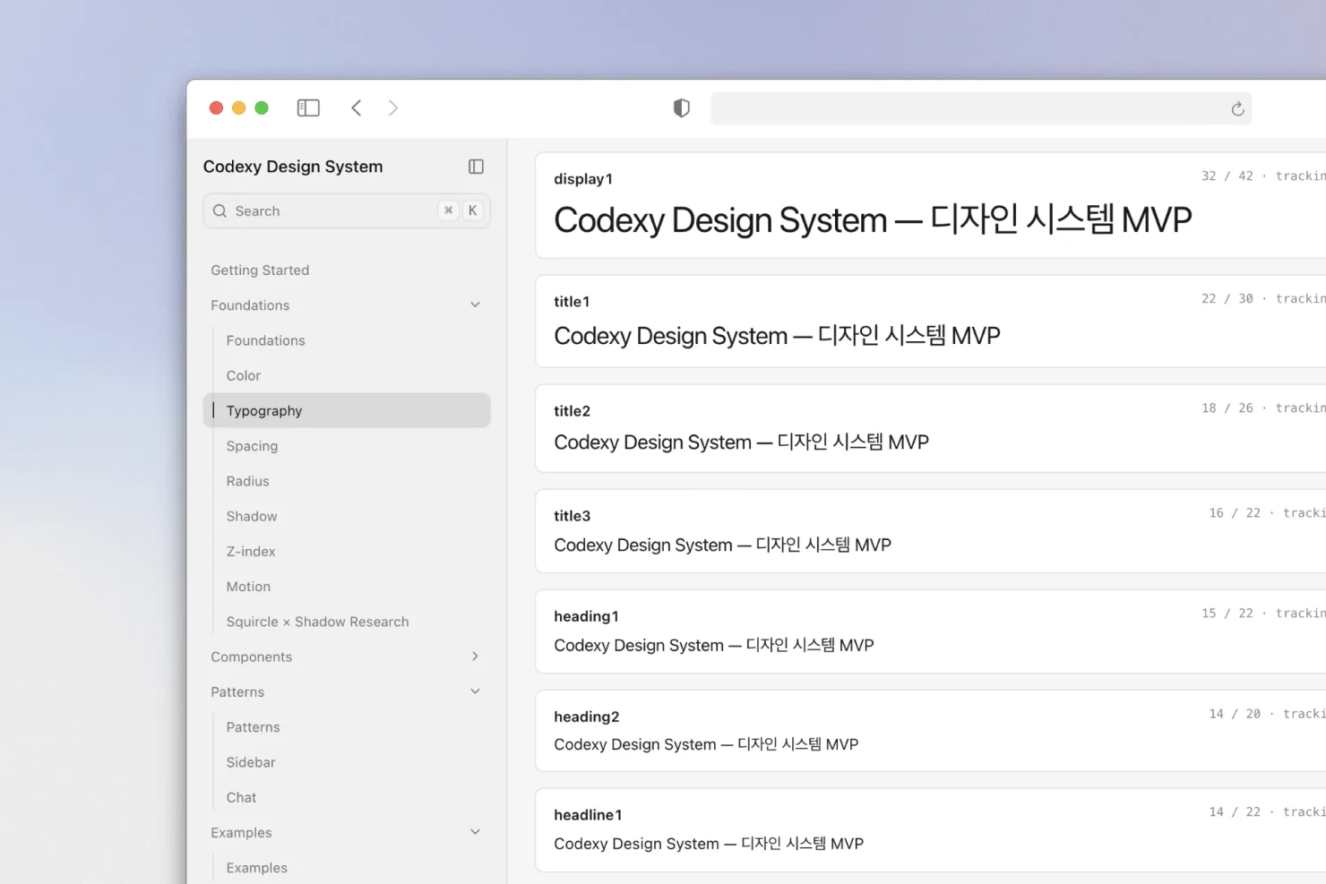
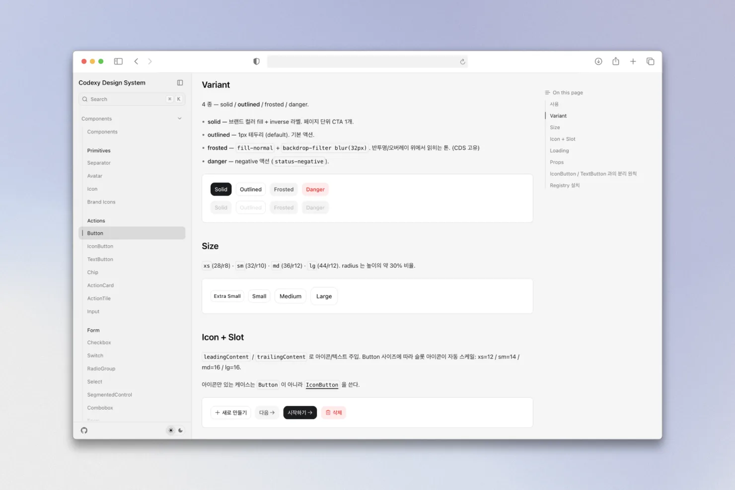
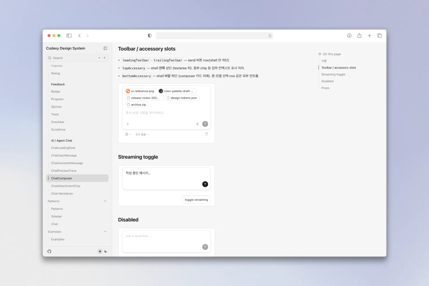
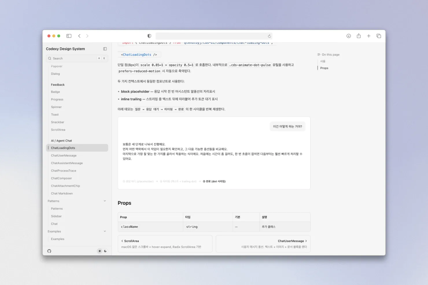
· cds-core: seven token sets (color, typography, spacing, radius, shadow, z-index, motion) plus a Tailwind preset · cds-ui: Radix-based components, from buttons and overlays to AI chat parts · cds-icons: a Phosphor wrapper with custom icons and brand logos · cds-markdown: a markdown renderer tuned for chat screens
· a documentation site covering foundations, components, patterns, and examples · released under the MIT license
Every time we built a product, we were making the same buttons, the same colors, the same spacing from scratch. To end that repetition, we decided to build them once, properly. Now our products stand on the same baseline, and it's out in the open for anyone else to use. The system holds to one principle: the source of design truth is code, not Figma. These days most screens are built together with AI, and what an agent reads is code, not Figma. So the tokens and components are structured for Claude or Cursor to read and edit directly.
Built on the structure below, and still growing. · structure: a pnpm and Turborepo monorepo, split into four packages for tokens, icons, markdown, and UI · two-track distribution: tokens and icons ship as locked npm packages, while UI components ship through a shadcn registry, a choice made to keep the "copy it and edit it in place" way of working · style: React 19, Tailwind v4, and Radix, with the Pretendard font included; macOS first, with Windows (Electron) supported · docs: a fumadocs-based documentation site, from foundations to examples · releases: versions and changelogs automated with Changesets; still 0.x, refining the structure until v1.0